Monday, August 27, 2012

Invented Forest

This is a work I did in a show called "Wall Power" which was curated by Jenepher Duncan at the Art Gallery of Western Australia in 2005. Me, Andrew McQualter, Rose Nolan, Robert Owen, James Angus, Kerrie  and Helen Smith.


The first pic is of the original drawing, then the install, final work, and floor talk. Robert Owen took the install shots.


Da Da!!!!


Me surrounded by admirers - makes it all worthwhile...

Sunday, August 26, 2012

Also in St Kilda

This is a work I made back in, er, was it 2006? It's a pretty big wall drawing I did in the stairwell of a large Victorian House in St Kilda. Danny Lacy helped me install it, and basically ended up installing it himself after I got a massive migraine and the pattern on the tessellated tile floor was swirling around and around in my head mixed in with the lime green and pink vinyl. It was a pretty stressful install - it felt quite dangerous because it was very high up and we were in a hurry.

I've taken these photos off various design blogs, but the bloggers have scanned them from Vogue Living. Funnily enough it gets used as an example of an easy and fun way to pep up a wall, and something you could do yourself!!  Don't try it at home people!!!


I spotted this on the way home from Mum and Dad's yesterday


In the window of the rug shop "Tsar" at St Kilda junction. I have mentioned in previous posts that I would like to design rugs, but there appears to have been a serious misunderstanding. I meant that I would like to design rugs, not that I want rug shops to start doing my stuff with vinyl!! Also, if you want vinyl, I am available for that too!! I'm right here in Melbourne, ready to go, with lots of ideas. My work is really very reasonably priced and I have to say, would probably look better than this effort.

Thursday, August 23, 2012

The Pinnacle of My Success


The year was 1999, things were going well in my  art career. I had run an artists run space, I had a studio at 200 Gertrude Street, I was in an artist run initiative with cool people, I had a teaching job at theVCA. I had finally cracked a show at first floor. Well then, you know what had to come next don't you? Yes, of course, Primavera. Me, Andrew McQualter, Nell, David Noonan, Darren Sylvester, Tim Silver and Matthew Bradley.


Rachel Kent was the curator, and it was a really great, well organised show. She had in mind one of the linear works I had been doing around that time, like "Last of the Big Spenders" at 1st floor, or "Gladiator" at Grey Area, but I had this really strong idea for a new work where a sneaker would be able to regenerate itself and would shed its own skin to reveal its new form. Everyone was mad on sneakers back then, and from 1998-99 the style had changed from this kind of organic, curvaceous type of shape to this hard edged but bulbous, space age type of thing. So I was extrapolating from that that the sneaker itself mutated into something else in a kind of techno/organic evolution. I used the transparent contact from Nylex for the shed skin part (on the left of the picture) and close up below.


It was a big success! And Monash University bought it for their collection, when Linda Michael and Jenepher Duncan were there. You can see it today at the Art and Design Building at Monash Caulfield Campus in Dandenong Road.

Photos by Andrius Lipsys


Wednesday, August 22, 2012

Problems inherent in the material

I think I've mentioned before that  my sister's friend, Ingrid had found all this tape in a skip outside the label factory. Unfortunately it  wasn't very sticky, and the tape itself was relatively heavy. After about a day it would be peeling off the wall. That was good when I was in the studio, making wall drawings, photographing them, then pulling them down, but in an exhibition situation it was  bad. I had to put double sided tape behind it, and in those days double sided tape was thick, so it made a bulge. It was also very hard to remove. Leslie Eastman told me that Robert Lindsay got very angry trying to remove the two works I had in his gallery in 'focus #2, m,m,m...' in 1996. That might be exaggerated, but for whatever reason, Robert Lindsay has never been friendly since, and I have always felt it was to do with the double sided tape on his gallery walls.

Eventually I realised you could actually buy sign writer's vinyl which was more uniformly sticky and came in bigger widths. It's all shiny though, and there's not such a good range of colours, especially in the pinks. You can't  get salmon pink, or musk, to name two colours I would like to use. But on the other hand, if you run out of a colour, you can buy more of it. The pink I used in the Robert Lindsay piece was the last bit of the roll, so I had to get it right first time, and that kind of situation used to stress me out.

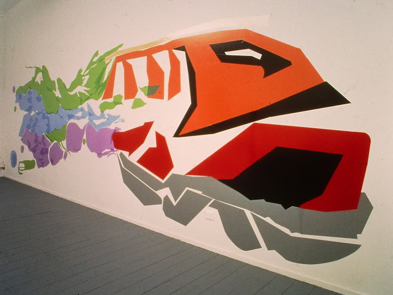
I also found that  Nylex would sponsor artists with free 'contact', which is book covering vinyl. They kindly gave me all this  light mauve, lime green and powder blue transparent vinyl, which I could layer,  making darker and lighter areas of colour, kind of like watercolour. I later realised they were giving it away because they weren't making it anymore. More on that when I discuss Primavera in another post.


 I used it in this show called "Gladiator" which was at Grey Area in around March 2008. It was inspired by computer games. The light green shape on the left was made of Contact, plus my tape out to the skip. The rest was made of sign writers vinyl from a place in Dandenong. The pink and silver one was at up at Blue Poles in Greville Street for a while. John Buckley was curating their program. The dark red and gold shape was selected for the Moet and Chandon Prize that year but I did not win. Later still it was curated into a show called 'Fair Game', a show about sport, which Anonda Bell curated in a funny little space at the NGV in Federation Square. By that time I knew that this particular brand of vinyl peeled under hot spot lights, but I felt I had to match the original work, and hoped for the best. Unfortunately it did peel, making me look like an idiot, which I was. I should have got better vinyl even if it did not match the original exactly.


I did this show 'Last of the Big Spenders' at 1st Floor later that year. I had the big room and Damiano Bertoli had the small space, and our work joined up near the edge. You can see his fluoro orange dots in the second picture down.
My work was meant to evoke a nine thirties style ocean liner, kind of a rolling, art deco effect.


Monday, August 20, 2012

Check out these modest little works

I was thrilled to be curated into a show called "focus#2, m,m,m...' which was curated by Brenda Ludeman and Jan Nelson, in February 1996. This was directly after finishing honours at RMIT, so you can imagine my excitement. The 'focus' shows were at Robert Lindsay's Flinders Lane Gallery, every February - the first show of the year, so the openings were always packed. I wanted to do a big, stand out work, but Brenda and Jan selected these two butcher's paper and tape drawings. So my contribution was modest and not really very noticeable. However,  I COULD HAVE TAKEN BETTER PHOTOS!!!


The other artists were David Rosetsky, Amanda Ahmed, Daniel von Sturmer, Leslie Eastman, and Greg (aka Felix) Deftereos.

Wednesday, August 8, 2012

My work in the Melbourne Art Fair

 The wall/floor drawing is called 'Moroccan Style Wall Drawing in Blue', the blobby sculptures are called 'In the Mist'.